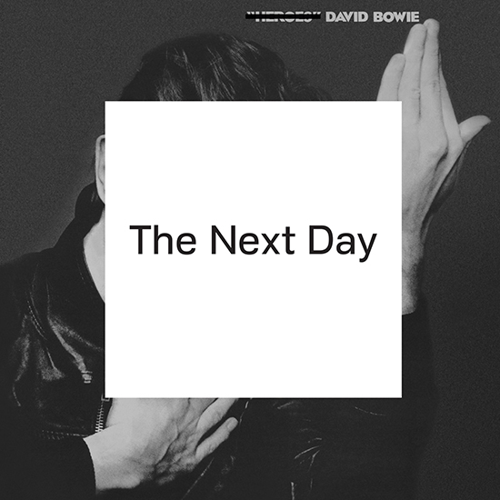
Let’s talk about something that truly deserves our anger: this album cover.
It’s not his ugliest album cover, certainly: it lacks the exasperating vulgarity of Diamond Dogs, the mid-80s insanity of Never Let Me Down, the overcooked end-of-his-ropeness of hours…, or indeed the flat-out godawfulness of this design firm’s previous Bowie mistake, Reality. But if you take a classic Bowie album cover and you just half-assedly strike through it, using the homeliest font you can find, you cannot fail to fail to improve on it. Putting a Post-It over the face of the Mona Lisa is necessarily going to be at best a notch below the original aesthetically, even if you hate the painting.
So all you’re left with is the concept. You’re two albums too late to “obscure the past;” the time for such a word was not hereafter but the day before yesterday, when Heathen came out. Obviously you know the absurdity of using an instantly recognizable image from the past to obscure it, and the designer admits this is impossible, but then why bother trying? If you’re trying to keep moving forward, keep moving forward. Do practically anything other than this. When a song from this album pops up in the shuffle, I can’t enjoy it for what it is, because I can’t see this cover image without thinking every time: this is okay, but damn, I could be listening to Heroes.
Remember the past, paint the future over it: yes. That’s what it’s all about. But then paint something. Don’t just react to what came before: envision a complete new future. Put all of your heart into it and have something to show for it.
…hey, maybe that applies to more than just album covers.
